MODULE
Feature band
One capability per band: a drawn number, a name, a paragraph, and whatever shows it beside them. The picture flips side to side so a run of six reads as a rhythm rather than a wall.
Three bands, alternating
The second one carries .feature-band-flip. Everything under the paragraph is something you brought — a rule-stack here, a row of chips there, nothing at all in the third.
-
01 DRAWING
Draw a plan, get a building
Sketch the footprint on the grid and pull it upward. There is no modelling step between the line and the volume; the extrusion is the same object you drew.
INPUT Mouse, pen or trackpadSNAPPING Grid, edge, midpointAUTO-LOOP Footprint drawn, then extruded -
02 MATERIALS
Flat colour that still reads as light
Faces take a single flat tone and the edge does the shading. You get depth without a render pass, and the file stays small enough to open on a laptop.
Per-project palettes Baked or per-faceSCREENSHOT The material panel, with a scene behind it -
03 EXPORT
Out to the engine in one step
Pick a target and the geometry is written the way that engine expects it. No cleanup pass, no re-triangulation, no surprise at import.
<ol class="feature-band">
  <li class="feature-band-item split">
    <div class="feature-band-copy">
      <p class="feature-band-head">
        <span class="feature-band-index">01</span>
        <span class="feature-band-rule"></span>
        <span class="feature-band-kind">DRAWING</span>
      </p>
      <h3 class="feature-band-title">Draw a plan, get a building</h3>
      <p class="feature-band-body">Sketch the footprint on the grid and pull it upward. There is no modelling step between the line and the volume; the extrusion is the same object you drew.</p>
      <div class="rule-stack rule-stack-aligned">
        <div class="rule-row rule-row-spec">
          <span class="rule-row-key">INPUT</span>
          <span class="rule-row-value">Mouse, pen or trackpad</span>
        </div>
        <div class="rule-row rule-row-spec">
          <span class="rule-row-key">SNAPPING</span>
          <span class="rule-row-value">Grid, edge, midpoint</span>
        </div>
      </div>
    </div>
    <div class="feature-band-media">
      <div class="placeholder" style="--ratio:16/10">
        <span class="placeholder-kicker">AUTO-LOOP</span>
        <span class="placeholder-note">Footprint drawn, then extruded</span>
      </div>
    </div>
  </li>

  <li class="feature-band-item feature-band-flip split">
    <div class="feature-band-copy">
      <p class="feature-band-head">
        <span class="feature-band-index">02</span>
        <span class="feature-band-rule"></span>
        <span class="feature-band-kind">MATERIALS</span>
      </p>
      <h3 class="feature-band-title">Flat colour that still reads as light</h3>
      <p class="feature-band-body">Faces take a single flat tone and the edge does the shading. You get depth without a render pass, and the file stays small enough to open on a laptop.</p>
      <span class="chip-row">
        <span class="chip">Per-project palettes</span>
        <span class="chip">Baked or per-face</span>
      </span>
    </div>
    <div class="feature-band-media">
      <div class="placeholder placeholder-warm" style="--ratio:16/10">
        <span class="placeholder-kicker">SCREENSHOT</span>
        <span class="placeholder-note">The material panel, with a scene behind it</span>
      </div>
    </div>
  </li>

  <li class="feature-band-item split">
    <div class="feature-band-copy">
      <p class="feature-band-head">
        <span class="feature-band-index">03</span>
        <span class="feature-band-rule"></span>
        <span class="feature-band-kind">EXPORT</span>
      </p>
      <h3 class="feature-band-title">Out to the engine in one step</h3>
      <p class="feature-band-body">Pick a target and the geometry is written the way that engine expects it. No cleanup pass, no re-triangulation, no surprise at import.</p>
    </div>
    <div class="feature-band-media">
      <div class="frame" style="--ratio:16/10">
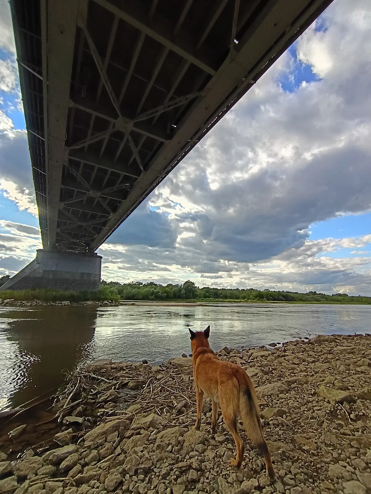
        <img src="/gallery/rico-05.webp" alt="Under the girders of a steel road bridge, a small dog on a wide stony riverbank." loading="lazy" />
      </div>
    </div>
  </li>
</ol>
The other shape: a claim, and its evidence in a pair
Swap `split` for `flow` on the item and the copy becomes a full-width block with whatever follows it underneath. Put a `split` of two media there and you have a comparison.
-
01 THE TWO VIEWS
Draw it flat, watch it stand up
The claim goes across the top at full width, and the evidence sits underneath as a pair. A drawing beside the model it became, or a before beside an after.
BEFORE The drawingAFTER The model it became
<ol class="feature-band">
  <li class="feature-band-item flow">
    <div class="feature-band-copy">
      <p class="feature-band-head">
        <span class="feature-band-index">01</span>
        <span class="feature-band-rule"></span>
        <span class="feature-band-kind">THE TWO VIEWS</span>
      </p>
      <h3 class="feature-band-title">Draw it flat, watch it stand up</h3>
      <p class="feature-band-body">The claim goes across the top at full width, and the evidence sits underneath as a pair. A drawing beside the model it became, or a before beside an after.</p>
    </div>

    <div class="split">
      <div class="feature-band-media">
        <div class="placeholder" style="--ratio:4/3">
          <span class="placeholder-kicker">BEFORE</span>
          <span class="placeholder-note">The drawing</span>
        </div>
      </div>
      <div class="feature-band-media">
        <div class="placeholder placeholder-warm" style="--ratio:4/3">
          <span class="placeholder-kicker">AFTER</span>
          <span class="placeholder-note">The model it became</span>
        </div>
      </div>
    </div>
  </li>
</ol>
Which one to reach for
Walkthrough is a sequence you read downward, and the media is the argument — a screenshot of an editor gets the full measure because half a column is not enough to make it out. This is a catalogue of independent features, where the picture supports a paragraph rather than replacing it. Reach for that one when the reader has to see the step; reach for this one when they have to read about the feature and would like to see it too.
Reference
Read from modules/feature-band.css when this page was built, so it cannot fall behind the stylesheet.
.feature-band.feature-band-item.feature-band-copy.feature-band-media.feature-band-flip.feature-band-head.feature-band-index.feature-band-rule.feature-band-kind.feature-band-title.feature-band-body--ds-accent--ds-font-body--ds-font-display--ds-gap-block--ds-gap-inline--ds-hairline--ds-ink--ds-ink-faint--ds-ink-read--ds-measure-wide--ds-pad-band--ds-rule--ds-rule-basis--ds-rule-strong--ds-text-body--ds-text-h2--ds-text-meta--ds-text-numeral--ds-track-meta--ds-track-snug--ds-track-tight--ds-weight-displayNotes
Write class="feature-band-item split" and the two columns, the stacking, the alignment and the container all come from split. This file adds the rhythm, the separator, the zig-zag and the numbered head — which is the only part of the design the library did not already have.
So the knobs are that primitive's: --split-min for how narrow a column may get before the two stack, and --split-gap for the space between them.
The item composes with a primitive, and which primitive is the whole difference. split puts the copy beside one medium; flow puts it above, as a full-width block, with whatever comes next underneath. A split of two media there is a comparison.
That it cost no new CSS is the point rather than a happy accident. A module whose second arrangement needs a second stylesheet has stopped composing and started branching, and the third arrangement is where that gets expensive.
feature-band-flip does nothing to the stacked shape, and nothing stops you writing it — there is simply no order to change, because the media are siblings in a split rather than columns either side of the copy. Reversing a comparison changes the argument, so it belongs in the markup where somebody has to mean it.
.feature-band-flip moves the picture to the left with order. The DOM order — the words, then the thing they describe — is what a screen reader and the tab sequence follow, and it is the right order in both directions. Do not reorder the markup to match the drawing; that trades a rhythm for a reading order that changes every other band.
It persists when the band stacks, and that is the cost. Narrow the specimen above and the flipped band puts its picture above its words while its neighbours put theirs below. Stopping that would take a container query, and the two this library allows are both there to prevent a defect rather than to even out a rhythm.
The design this came from alternates the ground under each band, and that is the one thing deliberately not carried over. A module that filled its own box would fight every surface it was ever dropped on, and a full-bleed slab is not available inside an article anyway. The alternation is still there if you want it — put placeholder-warm on every second picture and the run of blue breaks without the band knowing anything about it.
The source artwork drew the index in the border colour, which measures 2.03:1 on the dark ground — under AA even at the 3:1 large-text floor, for a number that is the band's only visible index. The source design does have a fifth ink for exactly this, marked "decorative marks only — never text", and neither theme here adopted it for that reason.
An index is text. So it takes --ds-ink-faint, the bottom step of the ladder that is text, and the recessive reading comes from its size and from sitting next to an accent kicker instead. If you want the whisper back, that is a colour role to add to both themes — not a value to write at the call site.
It is an <ol>, so it stays a numbered list for anything reading it — but the browser's own marker reads "1." where this wants "01" and is very nearly unstyleable. So the marker goes and you write the number. If the two disagree you have said one thing in the markup and another on the page, and only you can decide which one you meant.